
OPI Fall/Winter 2015 Venice Collection: Review and Swatches
12:59 AM

I cut my hand when I dropped a glass bowl in the sink RIGHT BEFORE getting this collection, so I hope you don't mind the swatch sticks! I'll try to insert actual nail swatches after publishing, especially for the red shades. The first six swatches are of the lighter, transitional shades and the last six shades are the darker, more fall appropriate shades. Most of these shades have a good formula that applies well in two coats. The only exception is My Gondola or Yours, which can get streaky and sometimes needs 3 coats. Descriptions in italics come straight from OPI.


- I Cannoli Wear OPI: My heart belongs to this pale, creamy gray.
- This color is so unique and I can't think of any other nail polish shades that are similar to it. I didn't like this on my skin tone at first because I'm not used to the muted chalky color but it's definitely grown on me. I was surprised at how good the formula is- no streakiness at all!
- Be There in a Prosecco: I'm living in the moment, and in this opaque creme.
- This is a brighter nude (on medium tan or darker skin tones), perfect for when you want to wear a neutral that still has some pop to it.
- Tiramisu for Two: I totally "dessert" this sweet coffee cream
- This is more of an actual nude for the gals that like an understated shade that doesn't wash you out.
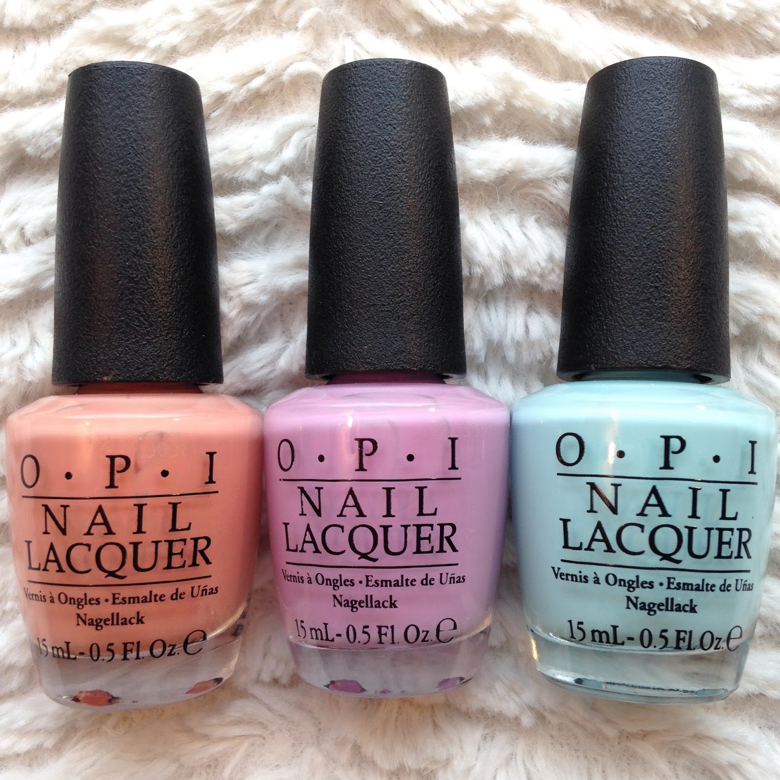

- A Great Opera-tunity: "Aria" ready to wear this gorgeous melon?
- This muted melon is perfect if you want slight wash of color- not too plain, bright, or dark.
- Purple Palazzo Pants: I've searched far and wide for this lovely lilac.
- A muted, pastel lilac that looks similar to OPI's Lucky Lucky Lavender at first glance but has a notable difference once side by side (LLL is much pinker).
- Gelato on My Mind: Deliciously sweet and icy-cool pastel blue.
- I knew this would be the first color I'd use from this collection as soon as I saw the promo pictures. It looks very similar to Essie's Mint Candy Apple and Blossom Dandy but I think Gelato has a much better formula.


- It's a Piazza Cake: Choosing this persimmon creme is as easy as pie.
- This shade screams AUTUMN! It reminds me of the brownish orange color that you find in stereotypical fall decorations. Personally, this is my least favorite color in this collection and I don't see a lot of my clients and other people gravitating towards it but there aren't many colors like this out there so it's still a good one to have in the collection.
- Gimme a Lido Kiss: Pucker up for this saucy, red shimmer.
- It's hard to tell from my photos, but this color is brighter than Amore at the Grand Canal and has a micro shimmer in it that makes it look extra shiny after topcoat. It's also a good shade of red, not too bright and not too dark.
- Amore at the Grand Canal: Let the romance flow in this ravishing red.
- I feel like I have to get super specific with red shades because there are so many in the market so here I go... This is a blue-toned, medium/dark red creme. I really like this one and I want a lipstick in this EXACT shade.


- Worth a Pretty Penne: Flaunt your fashion "cents" in this shimmery copper.
- This is a pretty copper with silver micro glitter in it. The copper makes this neutral enough to wear glitter everyday, even in a professional setting. It reminds me of OPI's Gelcolor A Real Show Copper, which is great because it was a limited edition release and had no matching regular polish.
- O Suzi Mio: This delicious shade of eggplant is all mine!
- I love all deep, dark colors and this one is no exception. I definitely see myself wearing this a few times during fall and winter.
- My Gondola or Yours?: Let's cruise the canals in this luscious black.
- At first sight you'd think this was just a plain ol' black but it is much more than that (I couldn't capture it well in photos). It's a super dark charcoal that is basically black but what justifies adding this to your collection is the barely there hint of shimmer that is only noticeable in the sun.
What are your favorite and least favorite shades in this collection? Let me know your thoughts by leaving me a comment down below. Thanks for reading and Happy Almost Fall! -XOXO
+copy.JPG)
5 comments
These are so pretty! I love the light gray and the mint polishes.
ReplyDeleteMolly and Stacie
Happy healing to your finger!!!!!!! The nail polish shades are simple beautiful.
ReplyDeletei've been seeing these around, and I really like the entire collection(s). I love the nudes, the reds, the pastels, and that bronze and that purple is stunning
ReplyDeleteThese are super pretty! I like how they range from reds to pastels and Worth a Pretty Penne is my FAVE!!
ReplyDeleteLove your OPI Venice review! I got Amore on the Grand Canal from Birchbox in August and its my RED!! I want to get Pretty Penny next! I hope your hand feels better!
ReplyDeleteUrsula aka Blueridge Beauty